The inner workings of double edged sword.
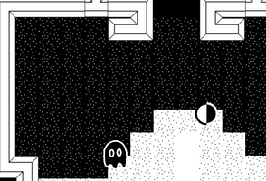
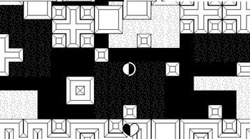
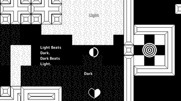

This post is about some inside information about my game and the process of making it!
The first time I saw the jam theme. I knew what I would do. A while back I was brainstorming about what game I was going to make in the game jam. I thought of a top down action game where you have a dark sword and a light sword. And there are dark and light enemies. I didn't really think this game would become a reality, because I never really finished any real games and I didn't know the jam theme.
The first thing I did was make the player. I spent about a half hour making the art for the player. I couldn't think of anything though. My player was either going to be all white or black, but that didn't make sense because a dark player was attacking dark enemies. But that's when it hit me. I decided that the player was half white and half black. But that didn't fit well on the background so I added an outline. I actually have no idea what the player is. I just leave it up the player's 🌈Imagination🌈. But the biggest reason why I used the circle dot thing was because I didn't want to make animations.
I made the light sword slash.
Next I made the dark ghost. I made all of the animations for it too. I will never tell you what program I use for making vector art. You can guess in the comments. But anyway, I programed the dark ghost and it worked good. I spent about a half hour "Playtesting" the game with myself.
Then I copied the dark ghost and changed the colors to make the light ghost. It was a hard process. I had to copy the animations to and animator controller!
The next day I made the character controller better. I added the deceptor, and I worked on it some more.
Later on in the project I was wanting to make a save and load system. I made a bad decision and tried to make my own custom save and load system. I spent the whole day on that. Then later it didn't work so I stopped using all of that code and just used the bult in playerprefs!
Another thing that I want to mention is that some enemies have less health points. The reason for this is complicated so I will refer to a reply that I sent on the jam page
"The reason I made some ghosts take less hits was because of an interesting game design thing I found out when playing it myself. On computers nowadays the screen has more width than height. So when a ghost is above or below you, you have less vision and it gave you a huge disadvantage. Originally, Level 2 was going to be completely vertical, as in the whole level you are moving upwards. But later I was having a hard time with the first ghosts of level 2. So I nerfed them a bit by giving them less health and making them move slower, also giving them a smaller look radius. I didn't know how else I could've solved the problem. I would love to hear your suggestions!"
Here in this section I want to show you some inside information about the project.
⚠️⚠️Spoiler Alert⚠️⚠️
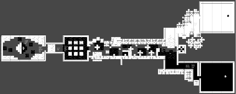
This is level 1 zoomed out so you can see the entire map.
Level 1 hides the Lightbar and Darkbar at the start. I used environmental storytelling to guide the player through the world. By the way, in the "Chaos Corridor" the second single block has collision blocks around it. I will fix this in the next version. I want to keep this game alive!
Next, the Level 2 Zoom Out.
This was designed after a warrior. The inspiration for the shield was the wooden shield from the nes legend of Zelda.
The "Left Arm" Is actually supposed to be armor because it is all white but now that is zoomed out it destroys the illusion.
I did not design the top section to look like a brain it was originally supposed to be a big maze but I was lazy.
Level 2 was designed around a temple theme.
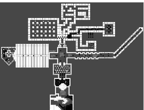
Level 3 Is particularly interesting. It is the first level to have a secret.
⚠️⚠️Bigger Spoiler Alert⚠️⚠️

This was designed after a space station. It has 3 central hallways.
By the way (Man, I have used that phrase a lot) Some "Meaningless Decisions" Actually matter in this level. Like in the right chamber, if you walk above the block the white ghost ahead is deleted. And at the start, if you begin moving left, the left door is closed, and if you move to the right, the right door is closed.
I am not going to explain the secret here, go find it yourself!
Level 4 is a cool level to look at. It was a bit rushed because it was made on the second to last day.
You can see the whole maze

It was designed to be a more linear level, but I branched it out at the end. It is kind of the same level shape as level 1.
Level 5
This level I want to keep a secret so that it motivates you to play it. Sorry! It is also shorter and not as well made as the others
Thank you for reading this post! I am going to try to keep my game active!
Files
Get Double Edged Sword
Double Edged Sword
Light Beats Dark, Dark Beats Light
| Status | Released |
| Author | whalesharkgames |
| Genre | Action, Adventure |
| Tags | 1-bit, 2D, Cute, Short, Singleplayer, Swords, Top-Down, Top Down Adventure, vector-art |
| Languages | English |
| Accessibility | Color-blind friendly, Subtitles, High-contrast, Interactive tutorial |
More posts
- 1.1 RELEASED!!!!Dec 28, 2023
Leave a comment
Log in with itch.io to leave a comment.